Researching & designing An Applicant tracking system (ATS), designed to find the best software engineering talent
The TLDR
User Problem
Without dedicated recruitment agencies, HR professionals in Sri Lanka struggle to quickly identify qualified software engineering candidates from vast applicant pools.
Team
1 Product Design Lead (Moí)
4 UX Designers
2 front-end engineers
1 Product manager
1 Development team liason
The Process
Interviews.
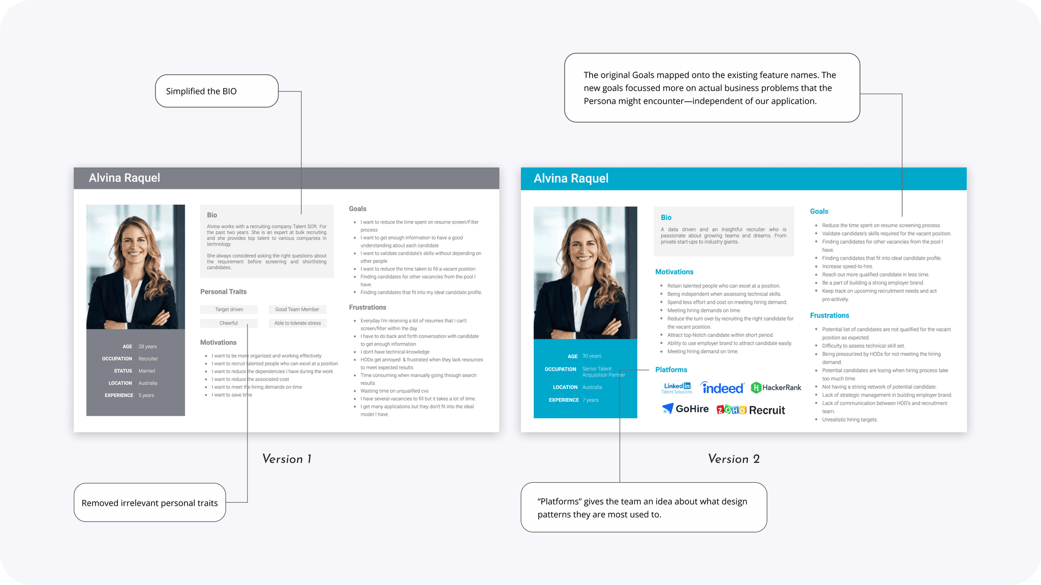
Personas
User stories.
Product feature roadmap.
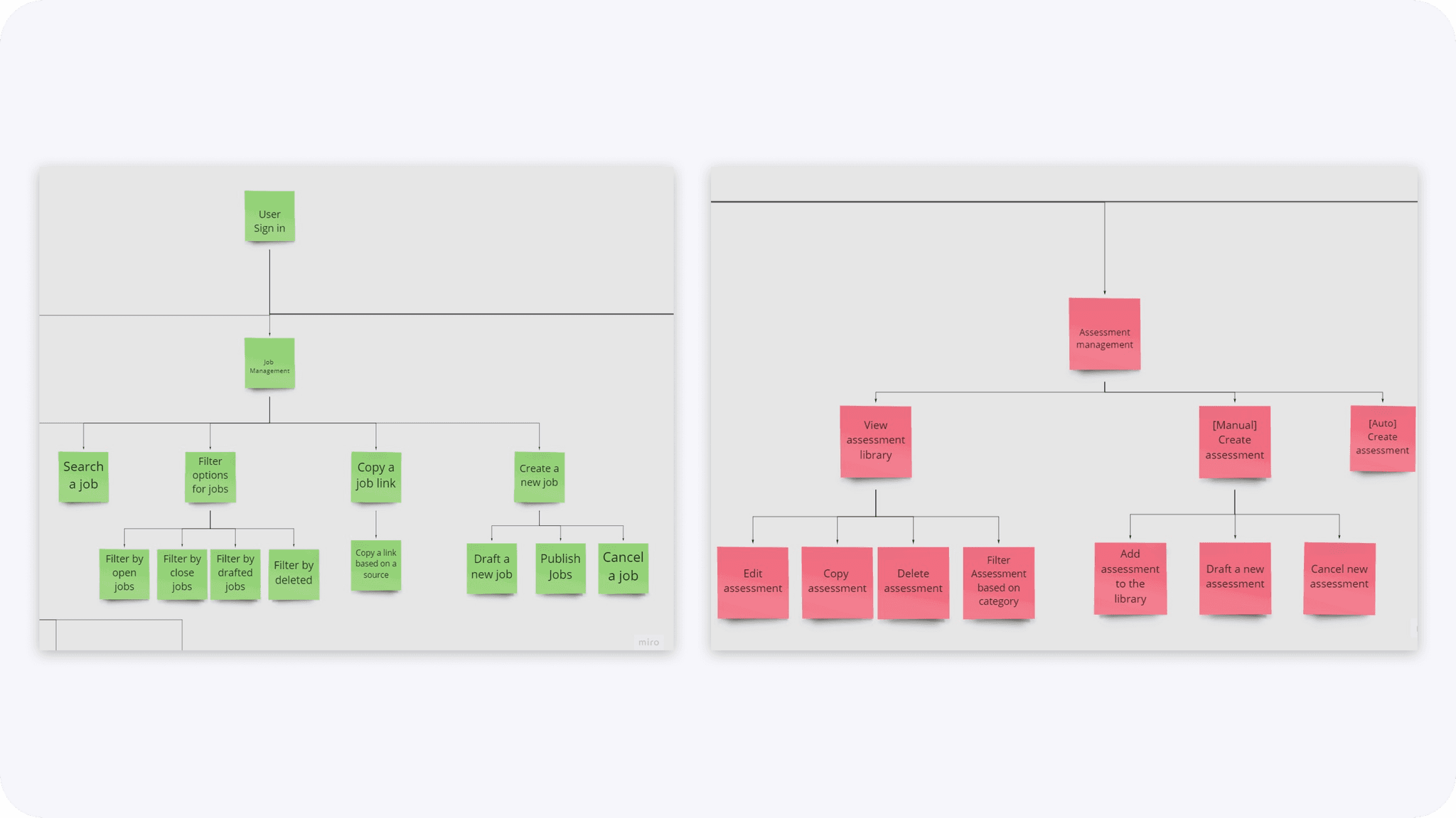
Information architecture map
Wireframing design and testing.
High-fidelity prototype design.
Usability testing.
Release v1
The Impact
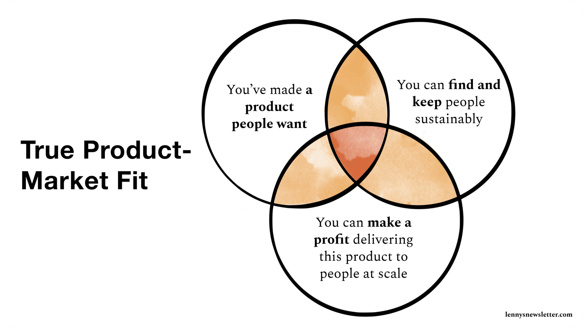
Validated product features, and identified Product-Market Fit (PMF).
Implemented Agile RnD processes.
Deliver Kastane V1 demo within 8 months.
Designed training workshops
Competitive Landscape
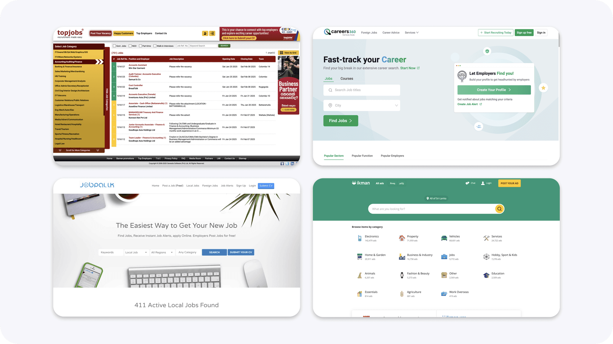
There's no end-to-end solution for job applications, hiring, and talent management in Sri Lanka.
Candidates prefer to use job boards like:
Topjobs.lk , Careers 360 , Ikman , Jobpalm.lk
Companies use in-house solutions that cater to their specific hiring practices.
LinkedIn, Glassdoor, Greenhouse etc. are all unpopular.
User Problem:
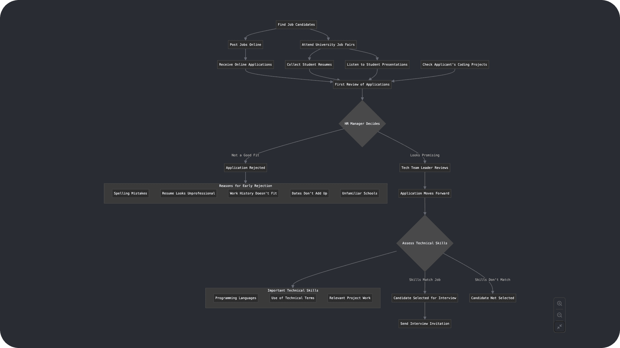
Senior staff spend hours/days/weeks helping select applicants even after a recruiter filters candidates
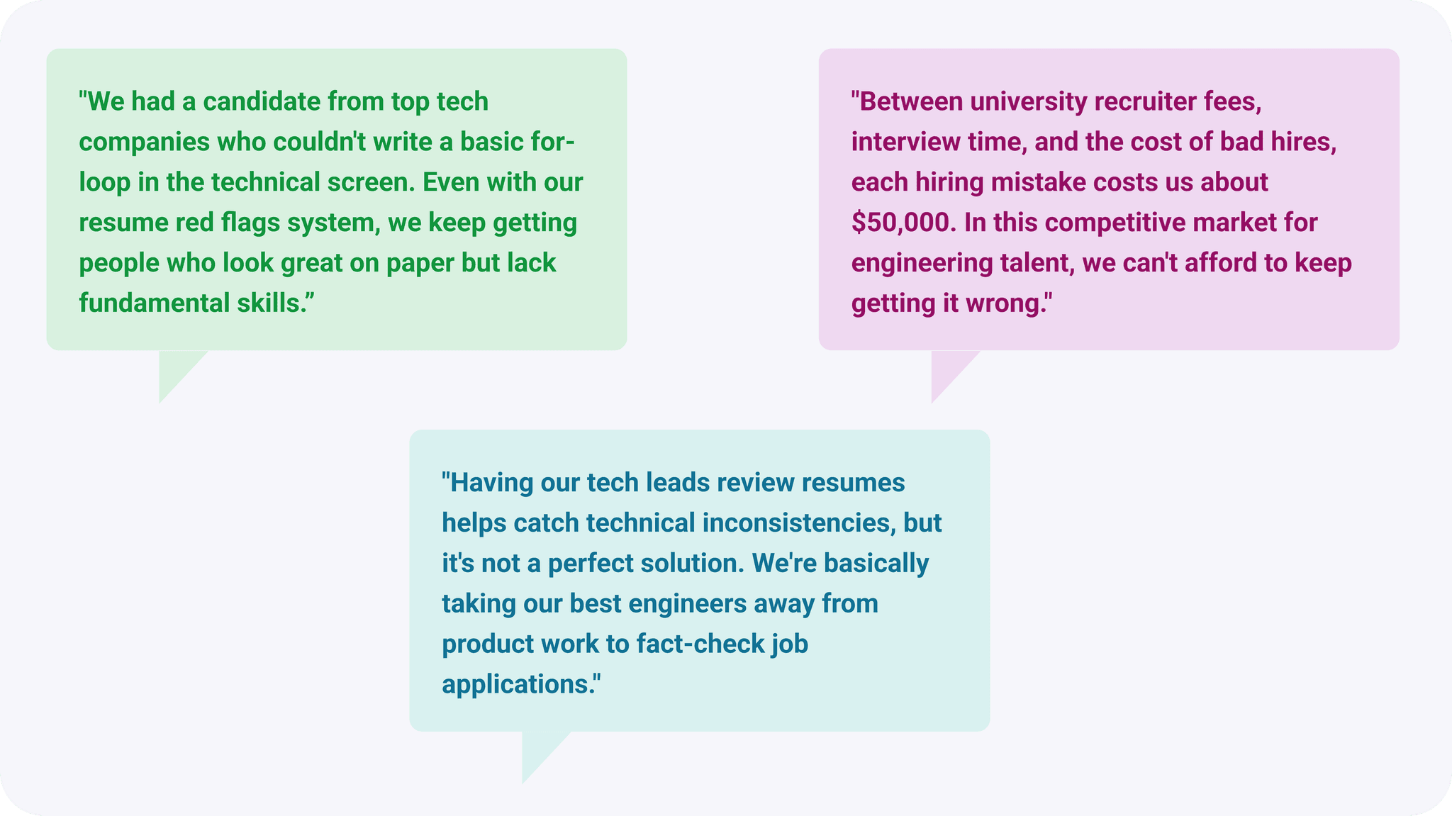
Candidates with impressive resumes frequently fail basic technical assessments.
Technical leadership involvement in resume screening helps catch red flags, but diverts valuable attention from product work.
The high cost of hiring mistakes is painful in the competitive software engineering talent market
Solution
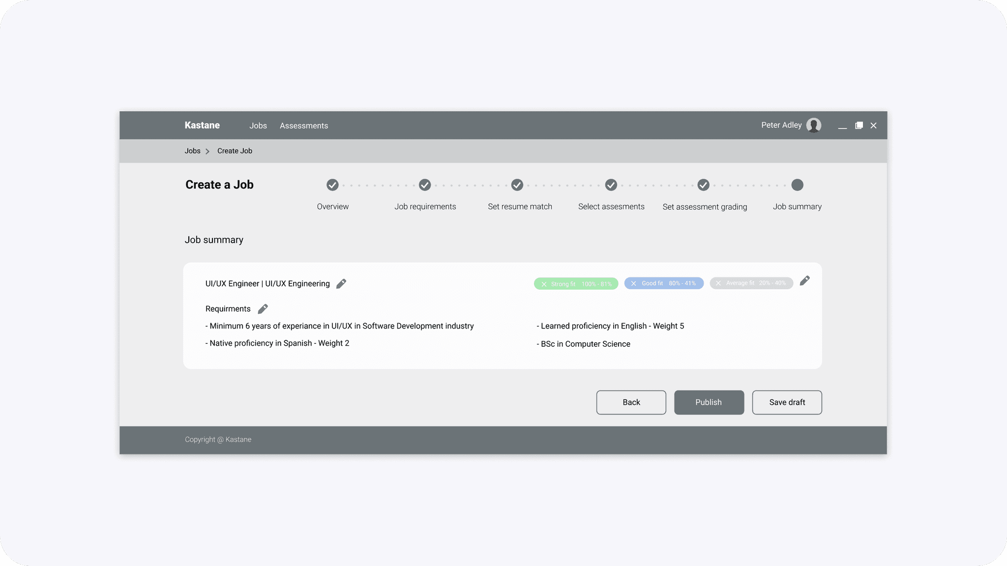
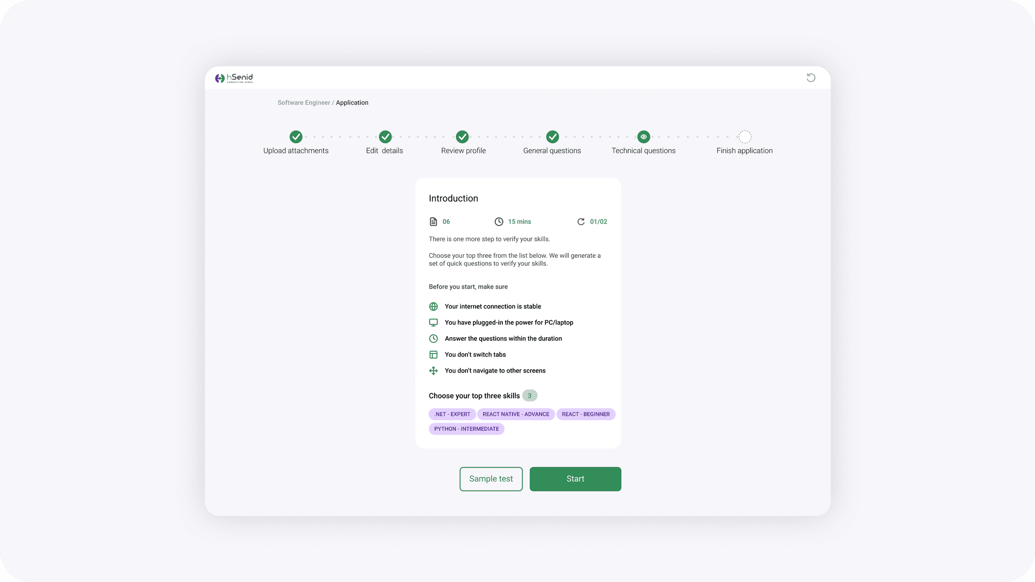
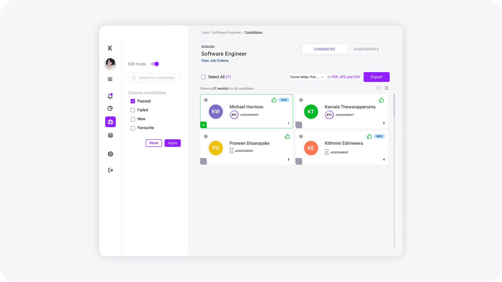
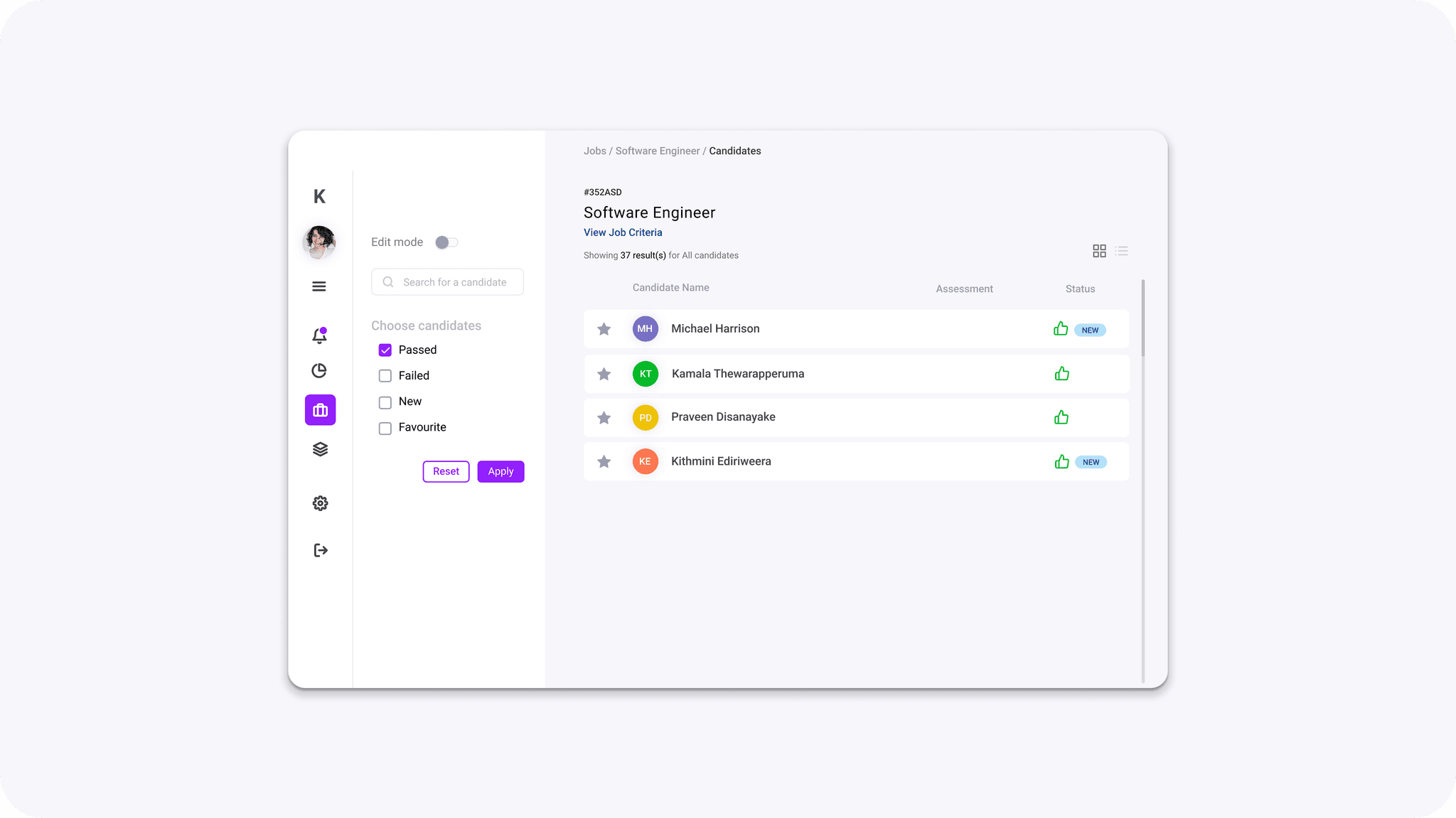
An Applicant Tracking System that verified, and filtered out 5-25% of unsuitable talent
Finding the User pain point
The Greatest Pain Point Was Around Bulk Talent Screening, and Screening Out the Most Unqualified Talent
In order to focus our MVP on achieving the strongest “Sean Ellis Test” score, our research goals focussed on identifying the most time/cost-consuming pain-points.
…which was revealed to be the bulk resume screening stage — which many users reported as being time-consuming, costly, and frustrating.
Internal Design Feedback Iterations
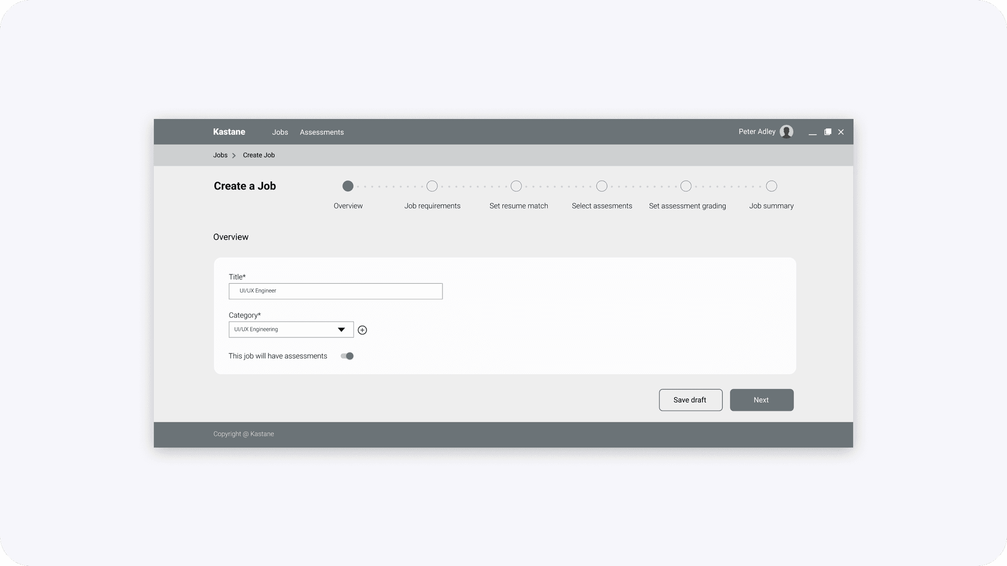
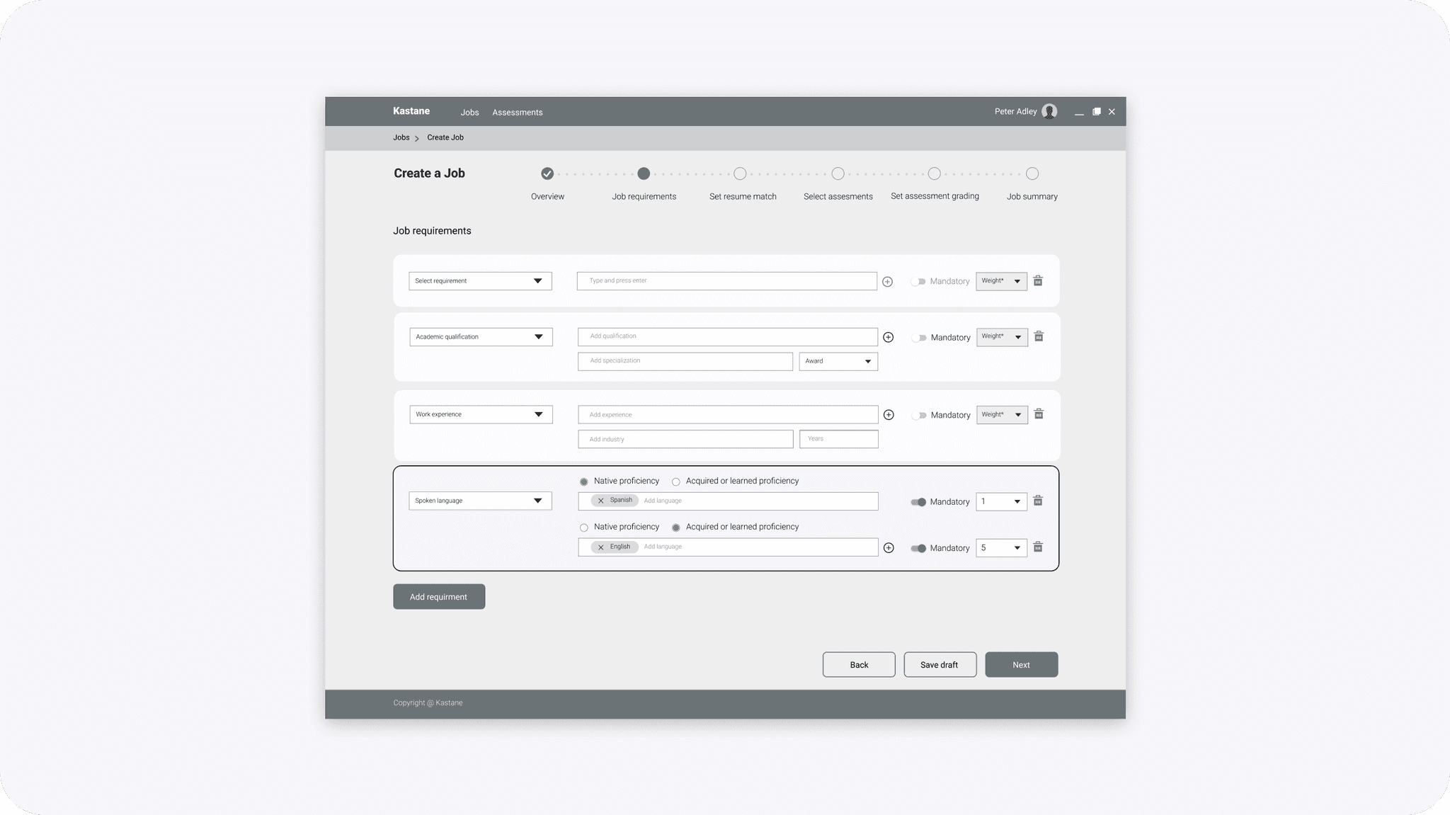
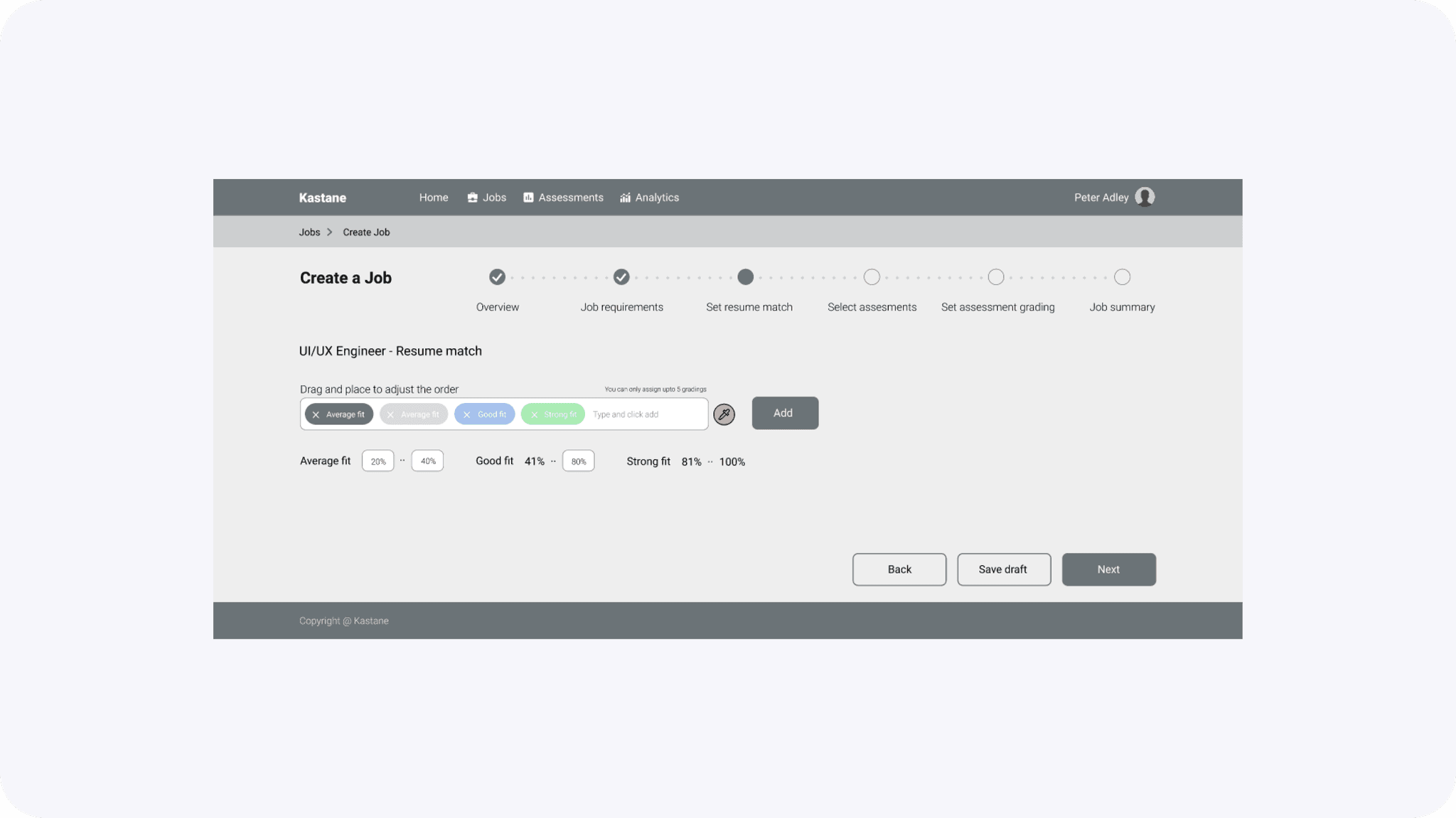
We took these new insights and updated the existing design deliverables
We tried to push how far we could improve the quality of applications coming through, while balancing the mental models that recruiters and applicants had collected over time.
Key Features
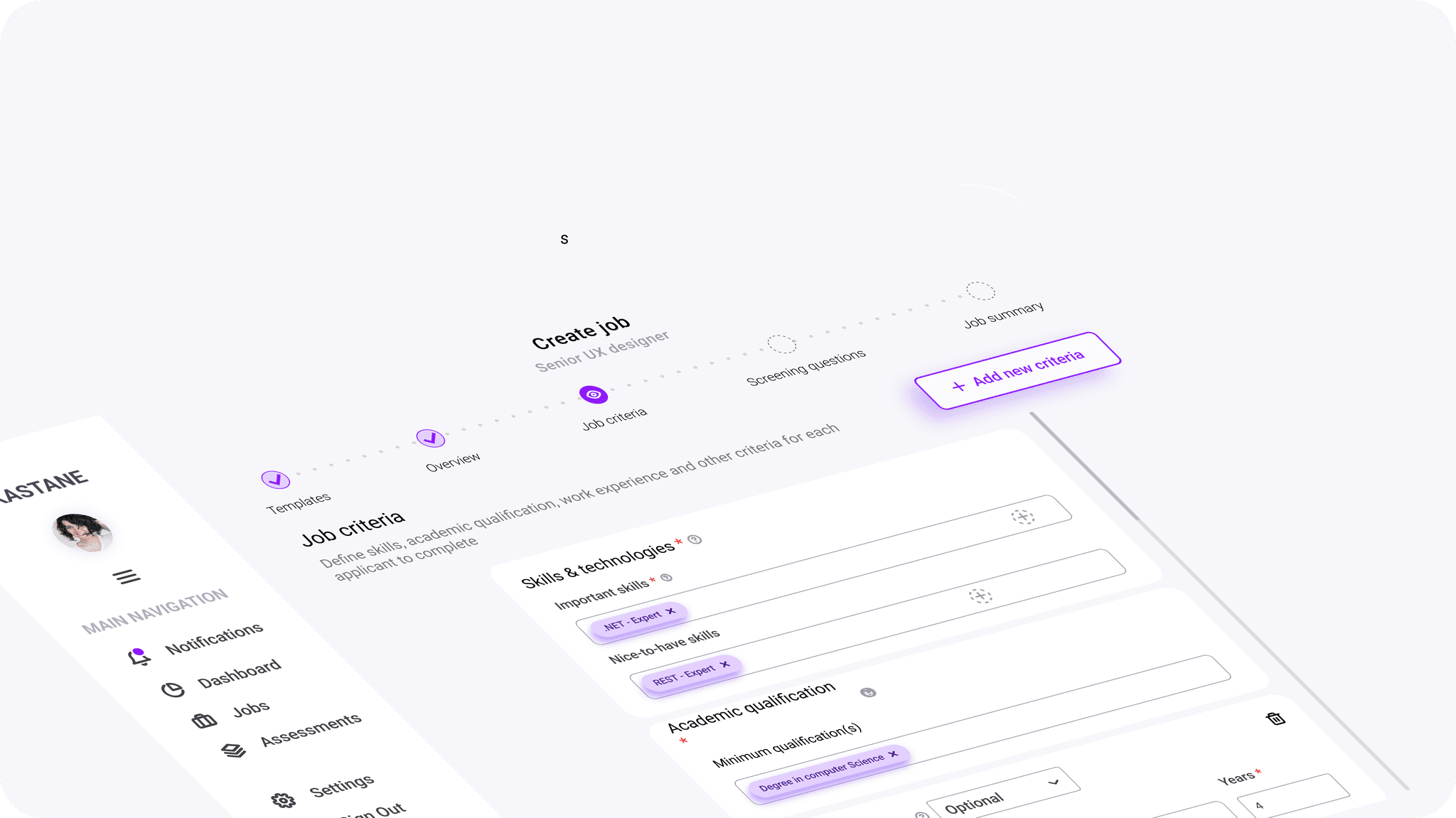
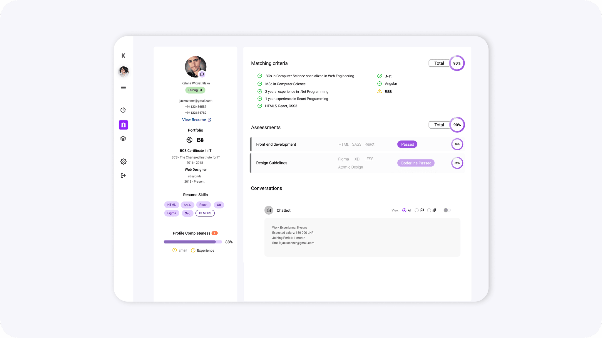
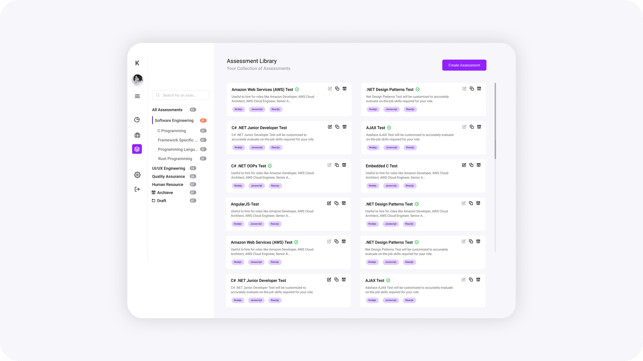
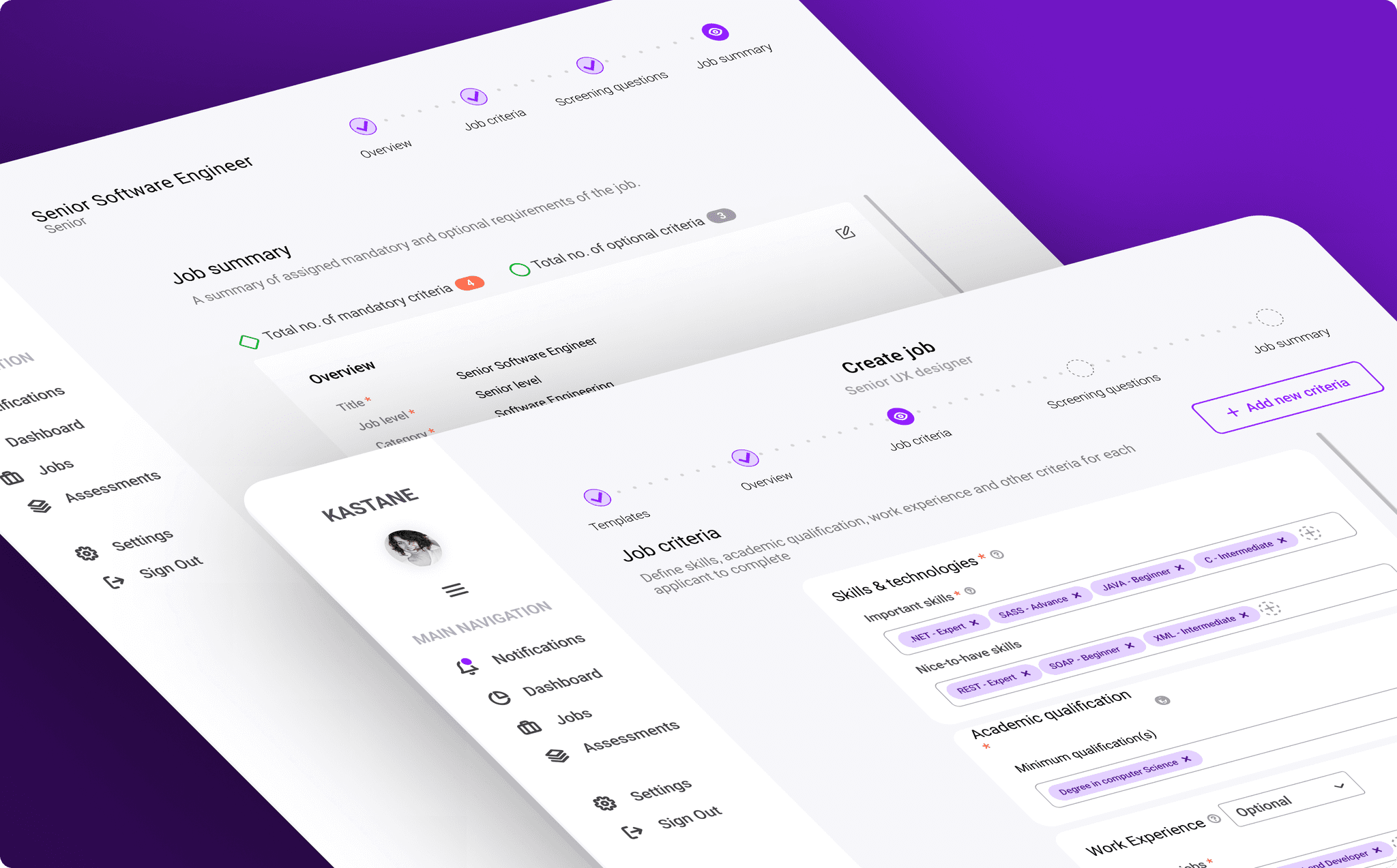
A Job Portal and Applicant Tracking System that Filtered Out 5-25% of the Underqualified Talent Pool
Accomplishments
V1 Launch: Strong Product-Market Validation, 12.5% Usability Gains, and Cross-Team Research Repository
Product Market Fit
Validated & measured core PMF via:
“How would you feel if you could no longer use Kastane” open question.
MOM Test interviews
Usability Issues
Resolved 8-12 usability heuristic violations per screen.
Improved usability test metrics by 12.5%.
Collaborating to ensure Product Delivery
Collaborated with research, design and technical teams to deliver V1 in 8 months.
Improving processes and Talent
Established evergreen research repository with 240 validated entries.
Delivered 6-12 month feature roadmap.
What I Learned
Balancing Business Value, Feasibility, and Team Dynamics
⚖️
Balancing business problems with usability can be tricky and not always overlap.
💻
Including developers in the design process DRASTICALLY reduced design-> dev roadblocks.
✅
Choosing design methods that leverage team strengths (storyboards vs. user stories) is way more important than sticking to the 'right' method.
